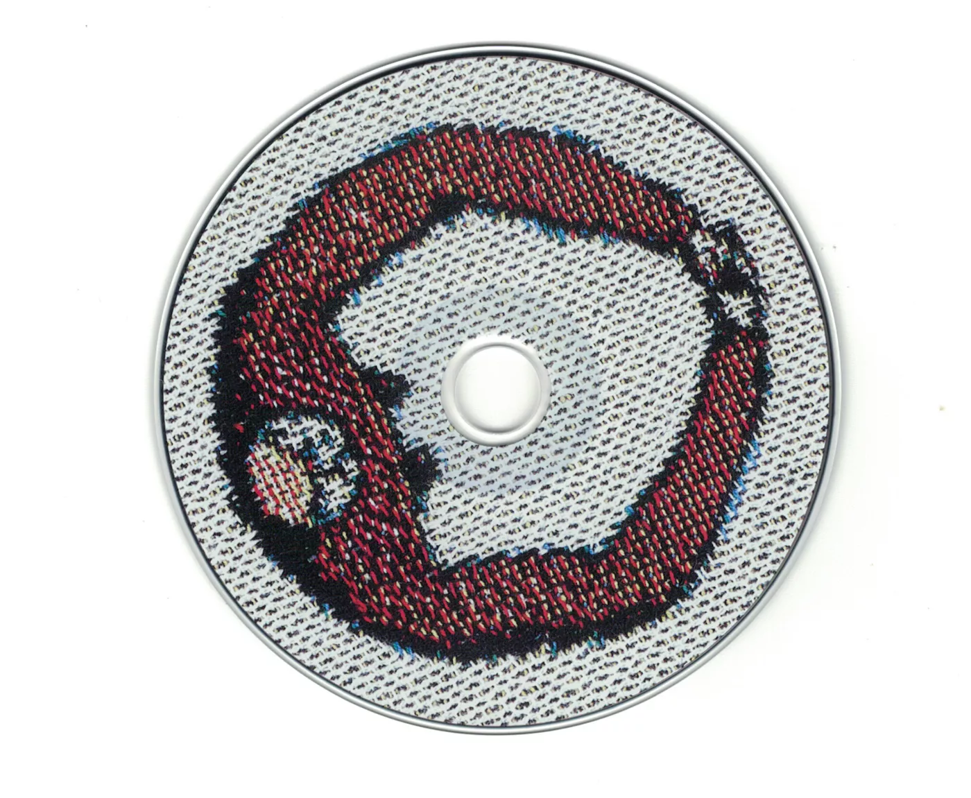
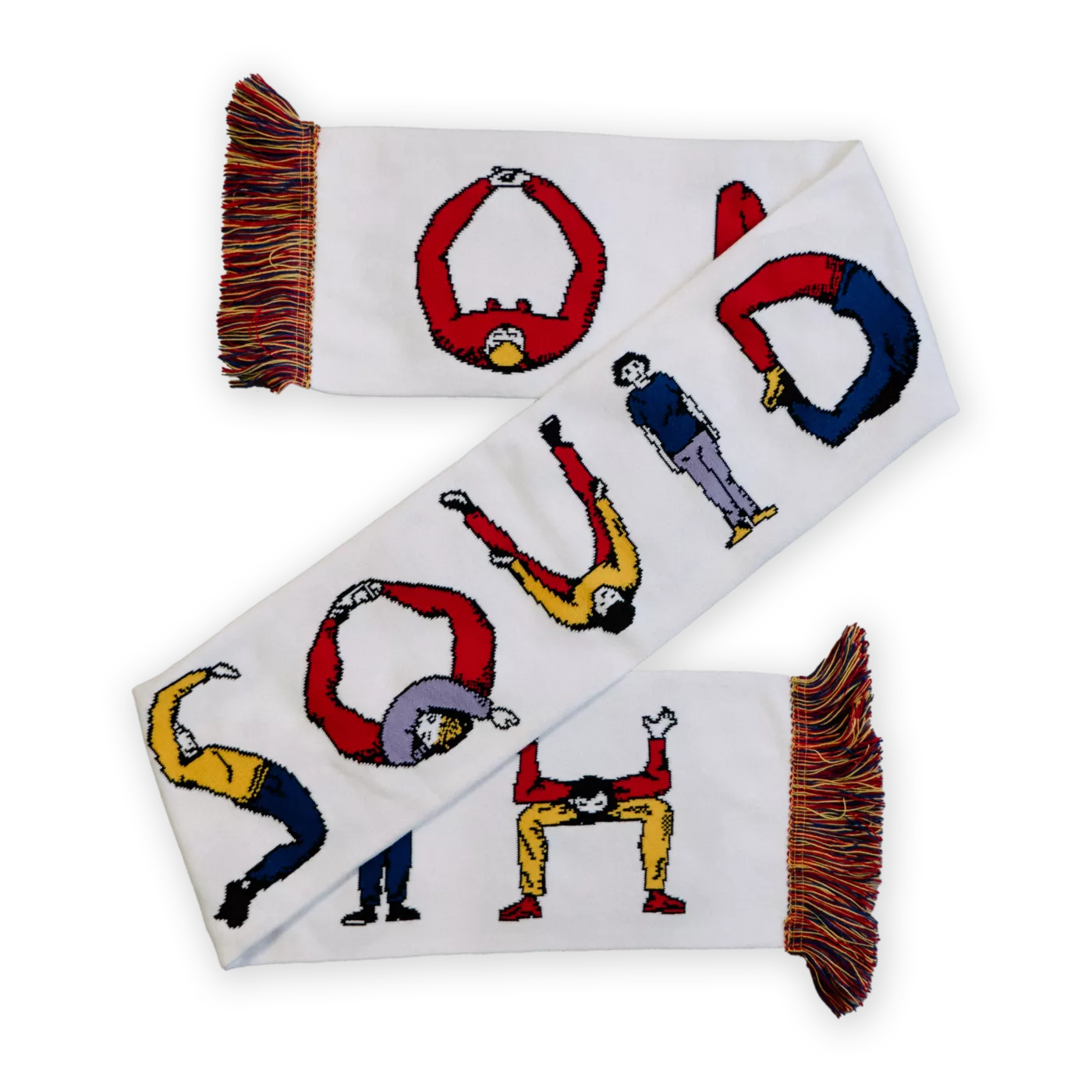
‘Lessons’ - an accompanying story to ‘O Monolith’ written by Paul Ewen.
Taken from an interview on the project
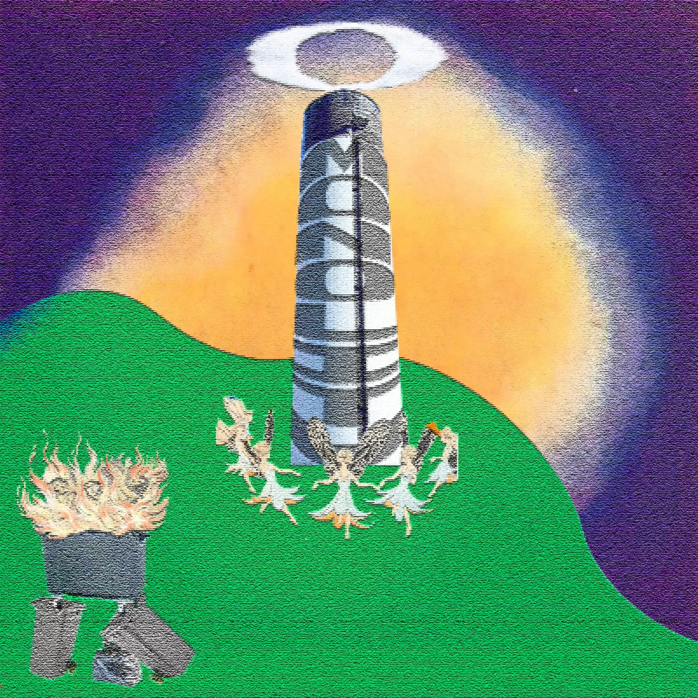
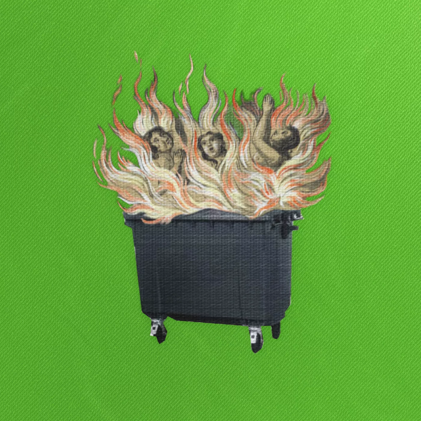
We wanted to create a modern tapestry which rather than representing a historic dramatic battle like the Bayeux ; it represents our present battles and fears with themes of isolation, environmental emergency, police brutality, existential crises, animism.
Pulling different folk elements often found in old English/European tapestries to juxtapose against modern industrialised elements, to create this world within which the album acts as a soundtrack to this chaotic end of day's scene. Weaving past and present folk history.
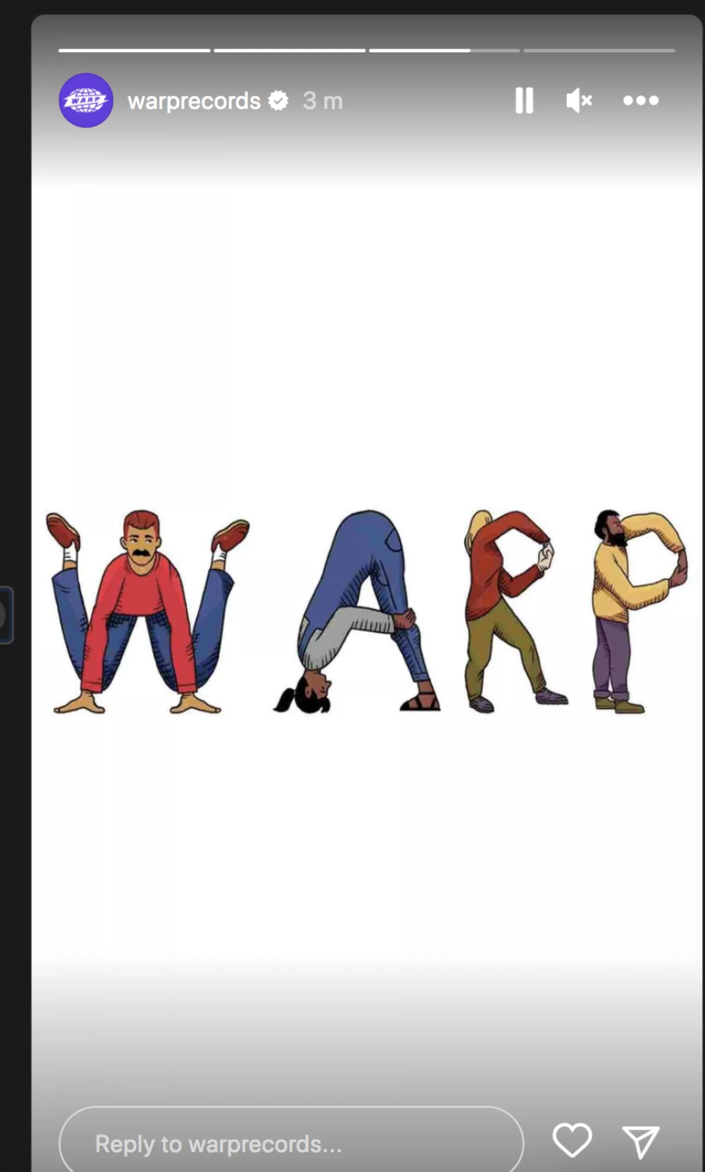
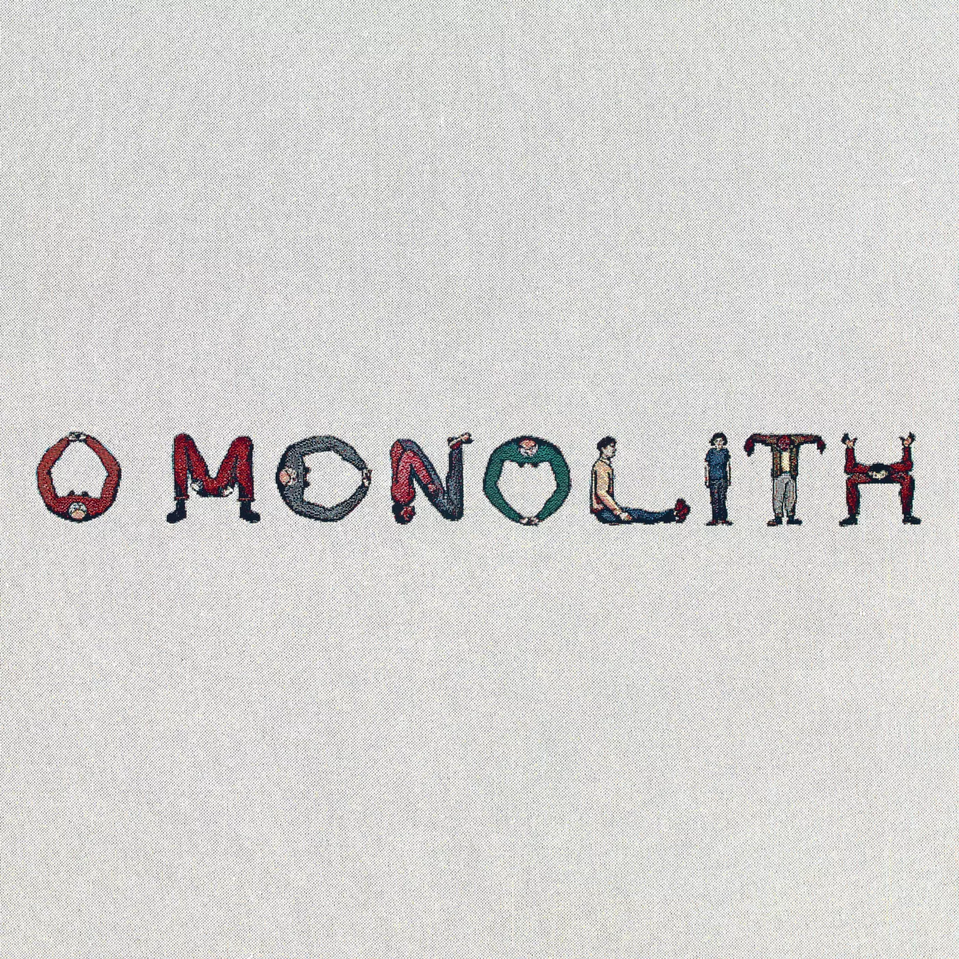
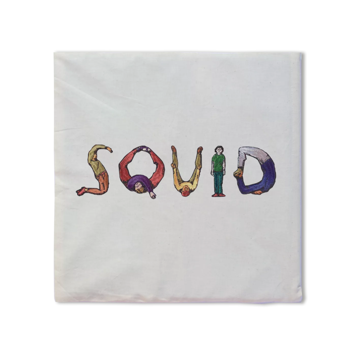
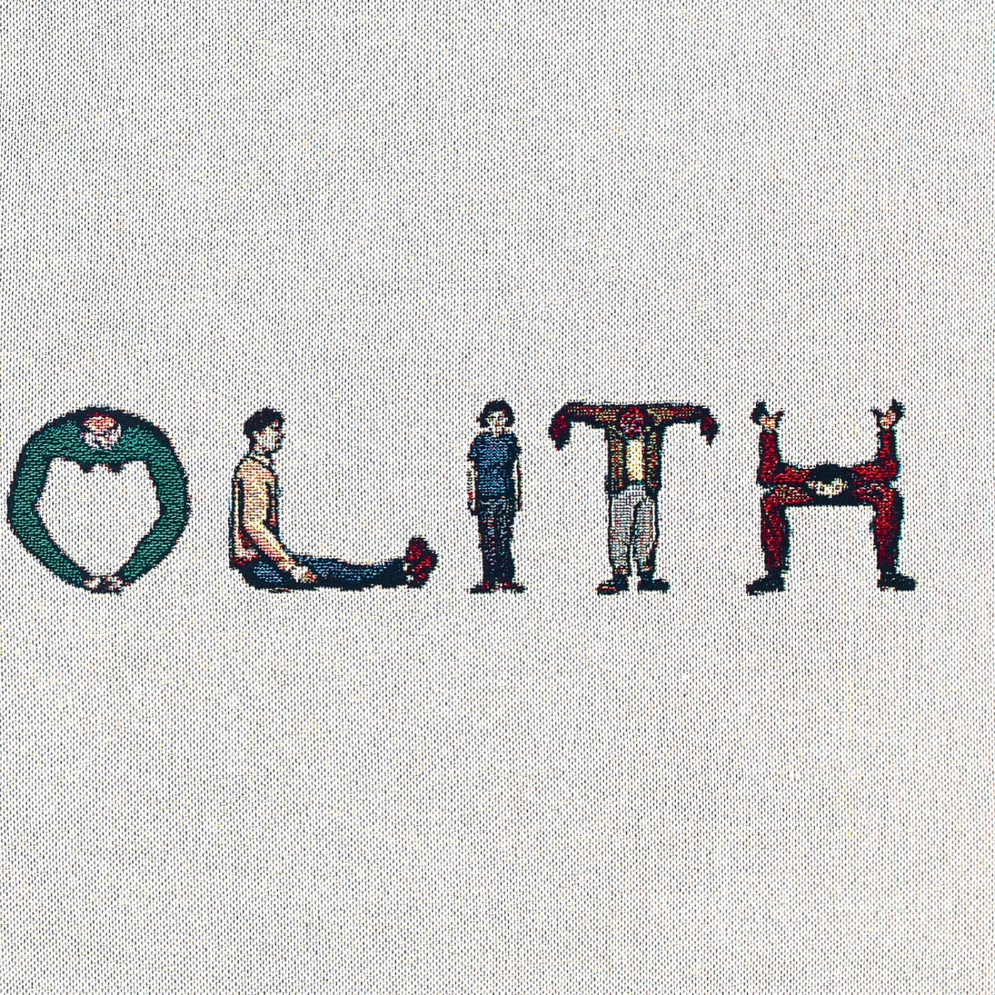
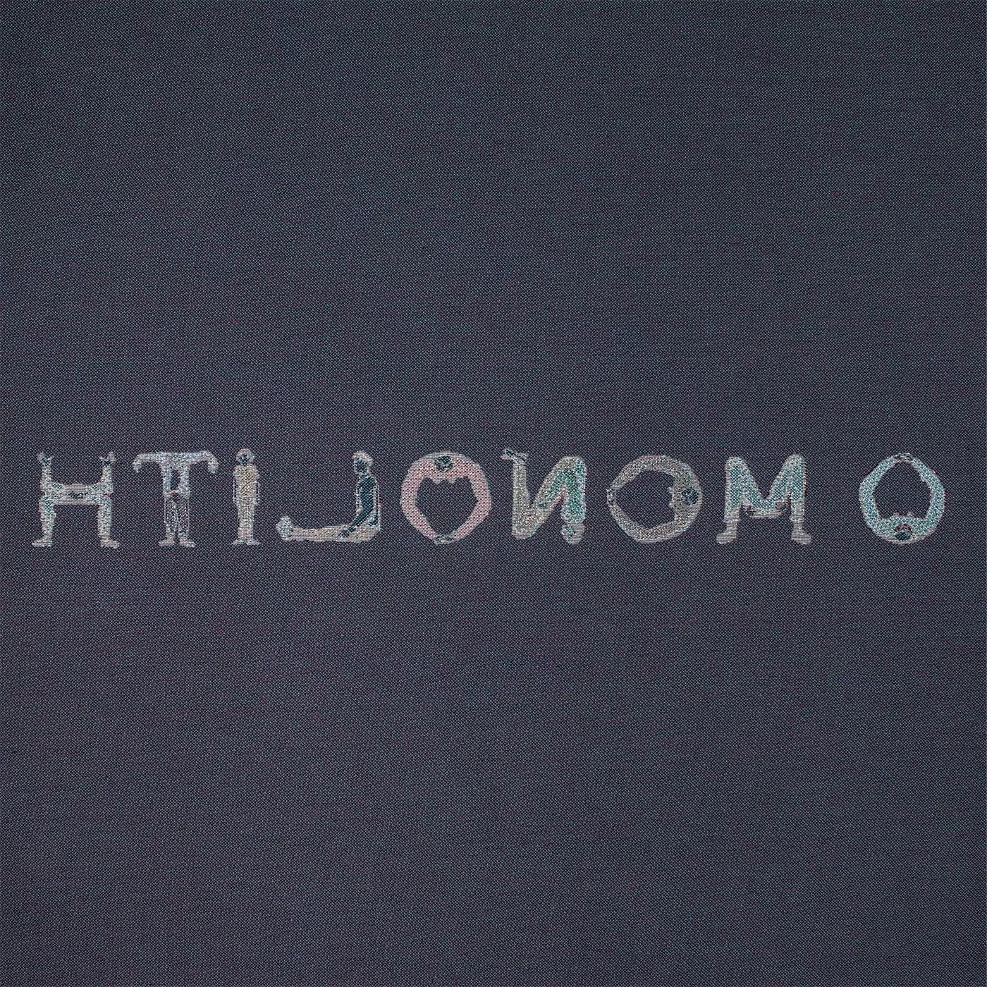
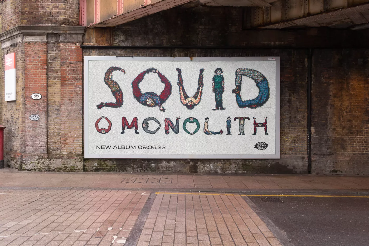
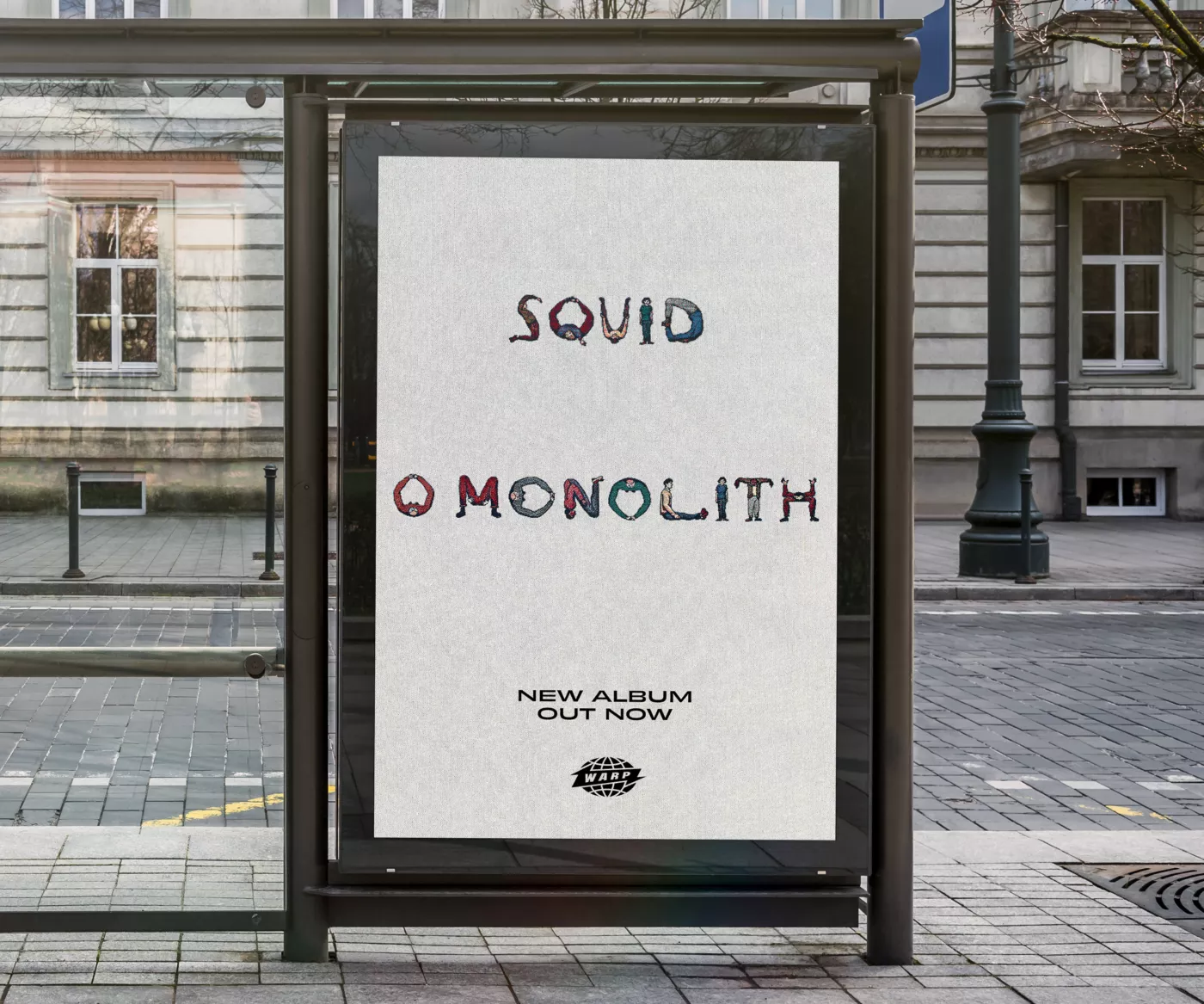
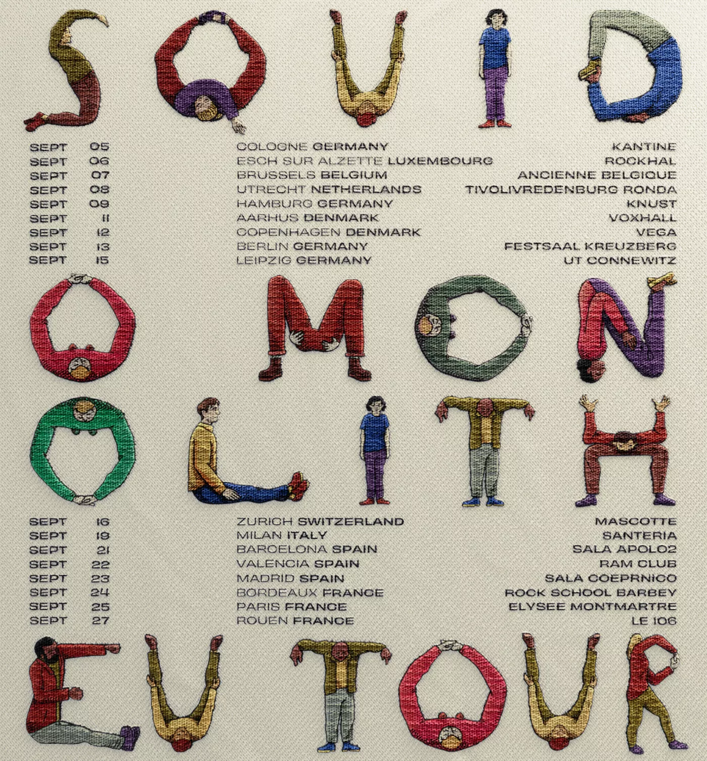
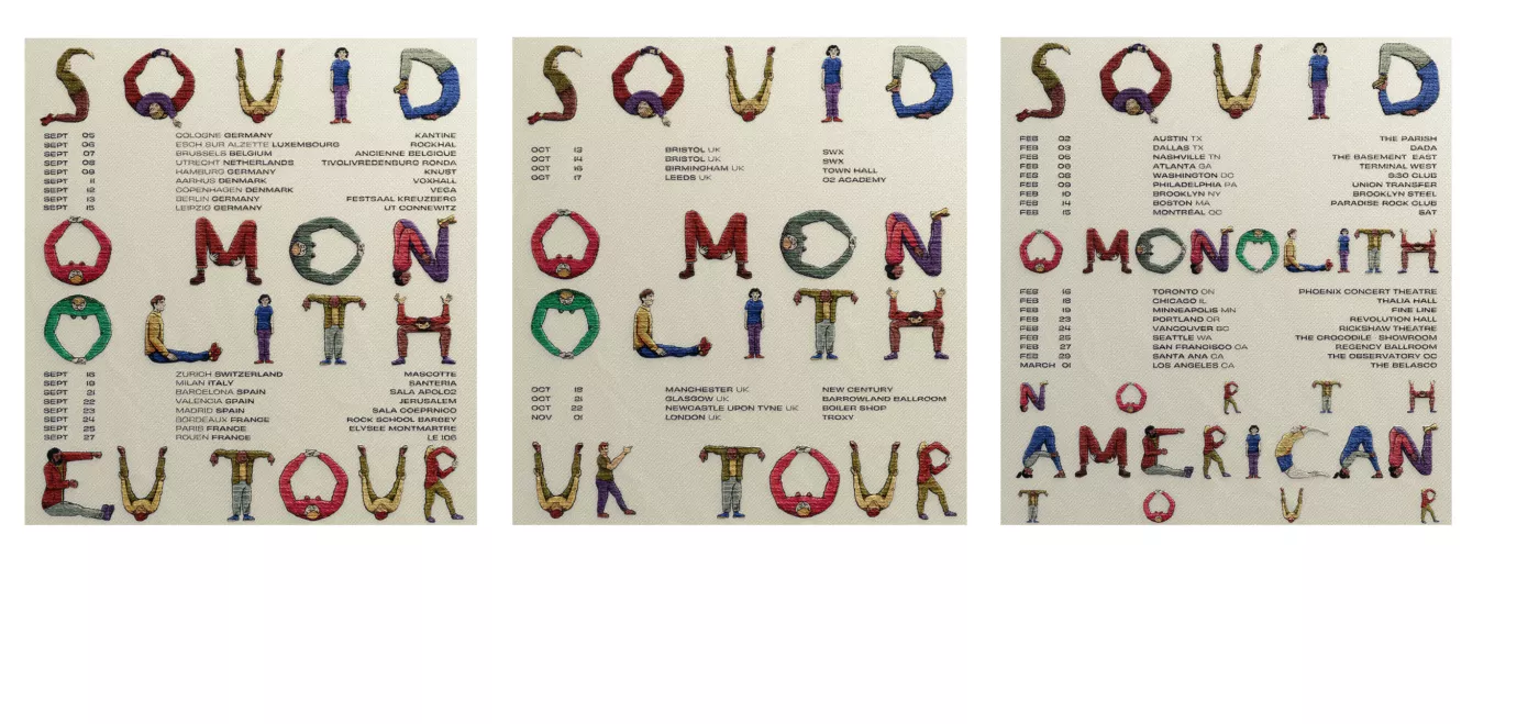
I came across this 17th century Alphabet "The Comical Hotch Potch" which reminded me of the style of characters depicted in many old English tapestries. These humans act in an obedient, devoted manner bending themselves to serve and worship what they spell out, fitting with the title O Monolith.

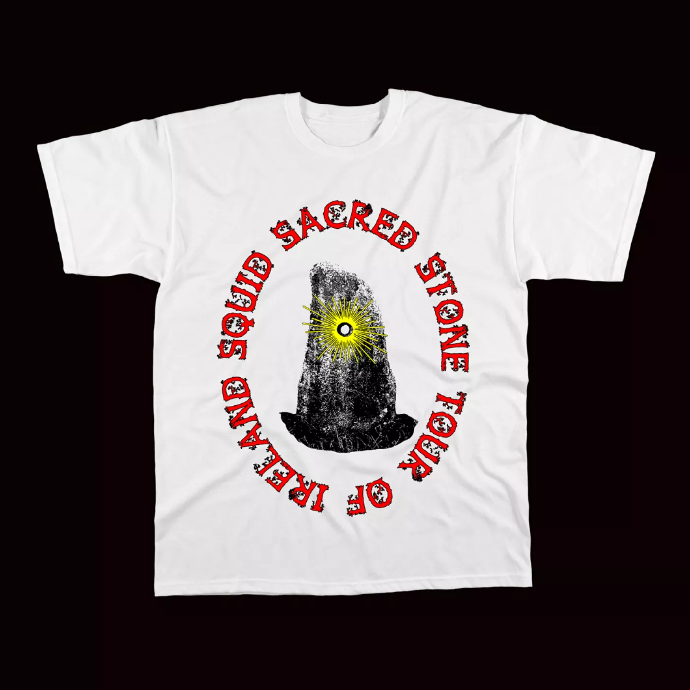
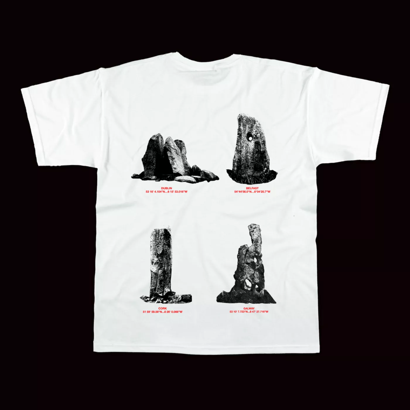
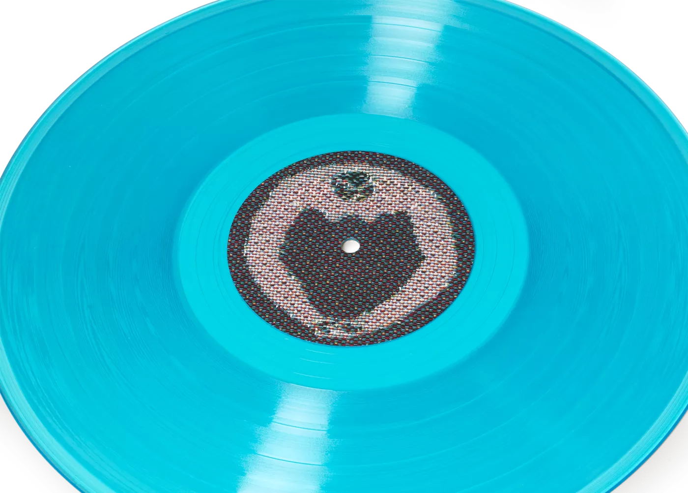
After creating different sketches depicting various scenes of fears and chaos conveyed within the album, we incorporate both ancient and modern monoliths, ranging from stones to Bristol incinerators. Eventually, it was decided that the most fitting cover would be the text characters only, omitting the nightmarish visions of the end of the world. In this way, rather than presenting an overtly theatrical hellscape, the characters represent the mundane cognitive dissonance that arises in response to current threats to life. The album's art is then a cover that conceals the underlying sense of fear conveyed within the music with the reverse of the tapestry as the back cover locking it in. The lyrics of the lead single, "Swing in a Dream," further underscore this theme, referring to a dreamlike state confined within the boundaries of a painting and devoid of any awareness of the surrounding world: "To live inside the frame/And forget everything."
Elements from the ‘end of days’ tapestry sketches were then use in a video game for single undergrowth
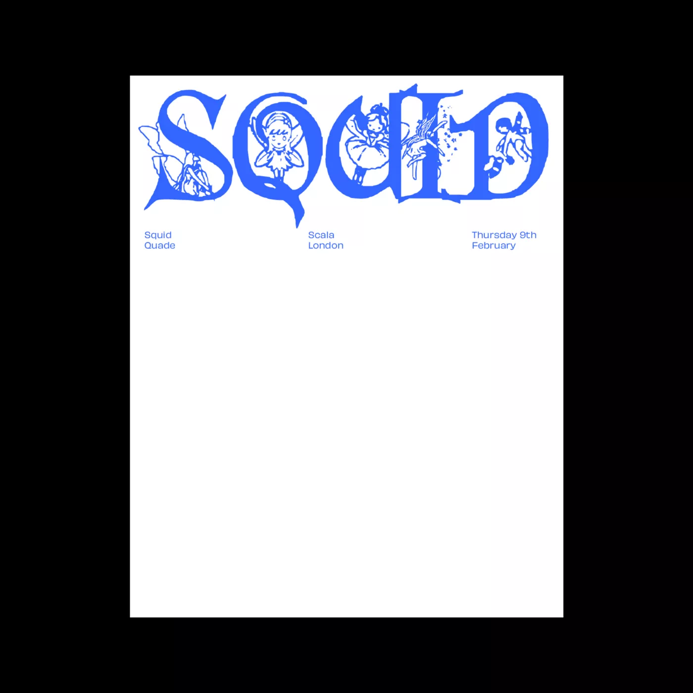
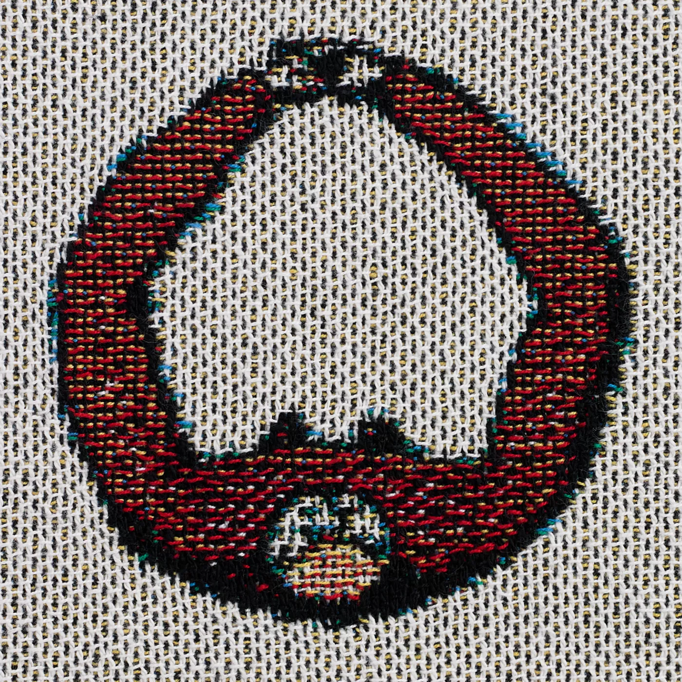
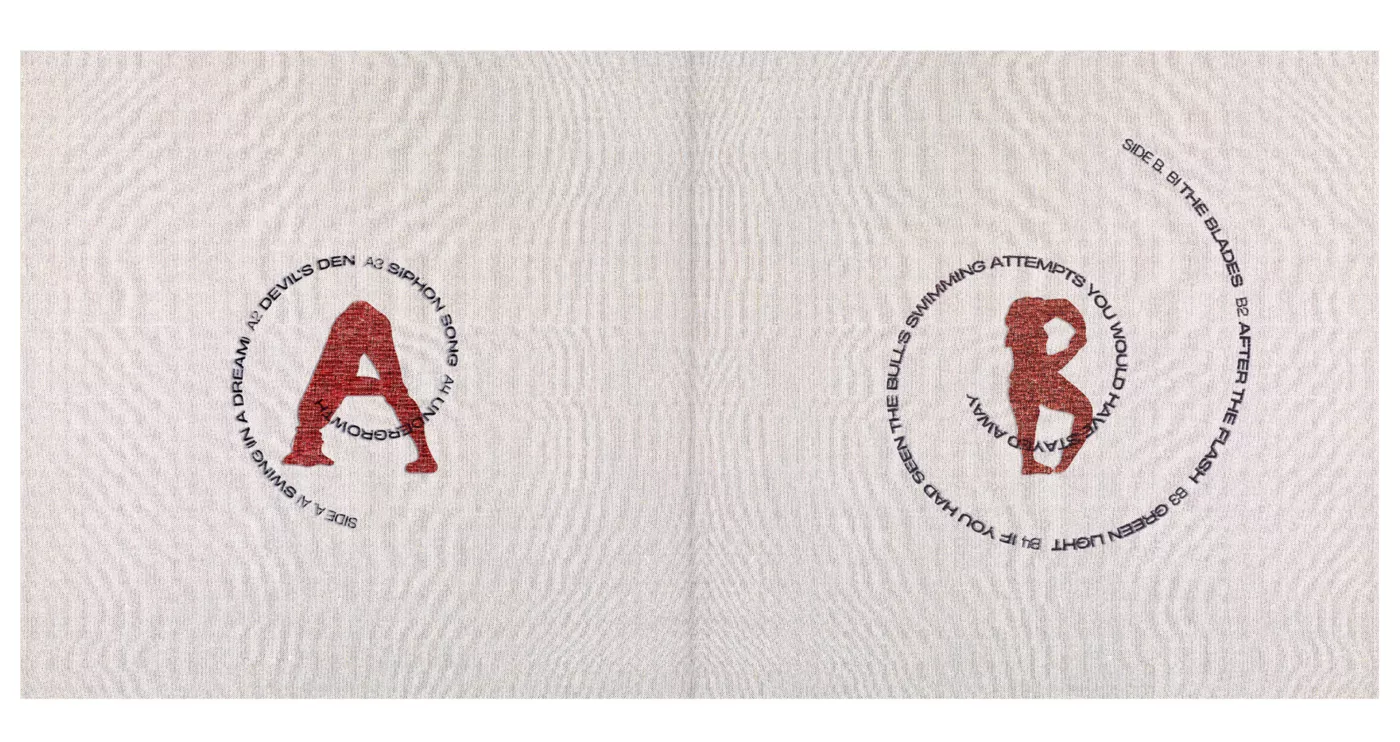
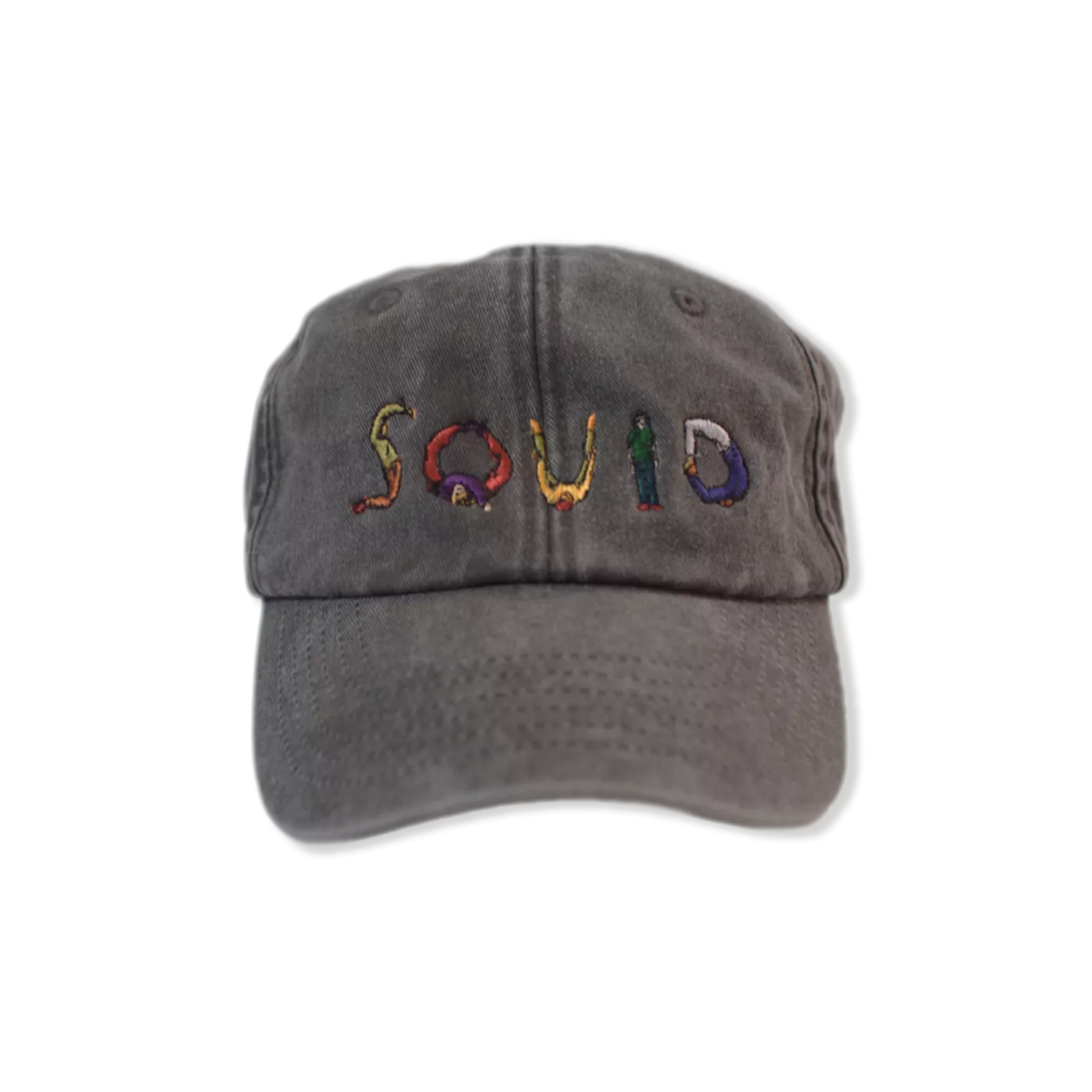
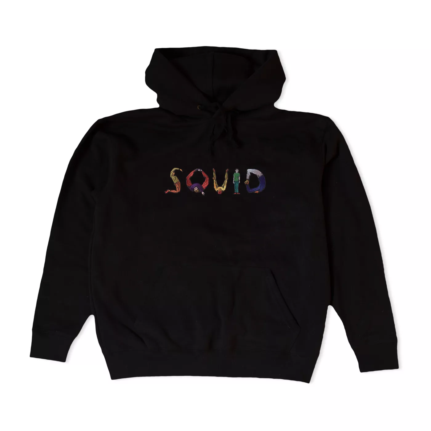
To modernize this 17th century human alphabet I got my brother Rob Torrans to redraw the letters to take it out of that time period. Rob’s new version of the alphabet grounded it in a contemporary timeline while the woven element gave it a folksy tone alluding to something important.
Squid fans can use it here
